Thermea
Spa Village.
A custom web build for Groupe Nordik's premium spa brand — three Canadian locations, one immersive editorial experience. The brief: make visitors feel the warmth before they book.
- Timeline
- 2025
- Role
- Frontend Developer
- Client
- Groupe Nordik
- Scope
- Full site · 3 locations
- Type
- Custom Web · Hospitality
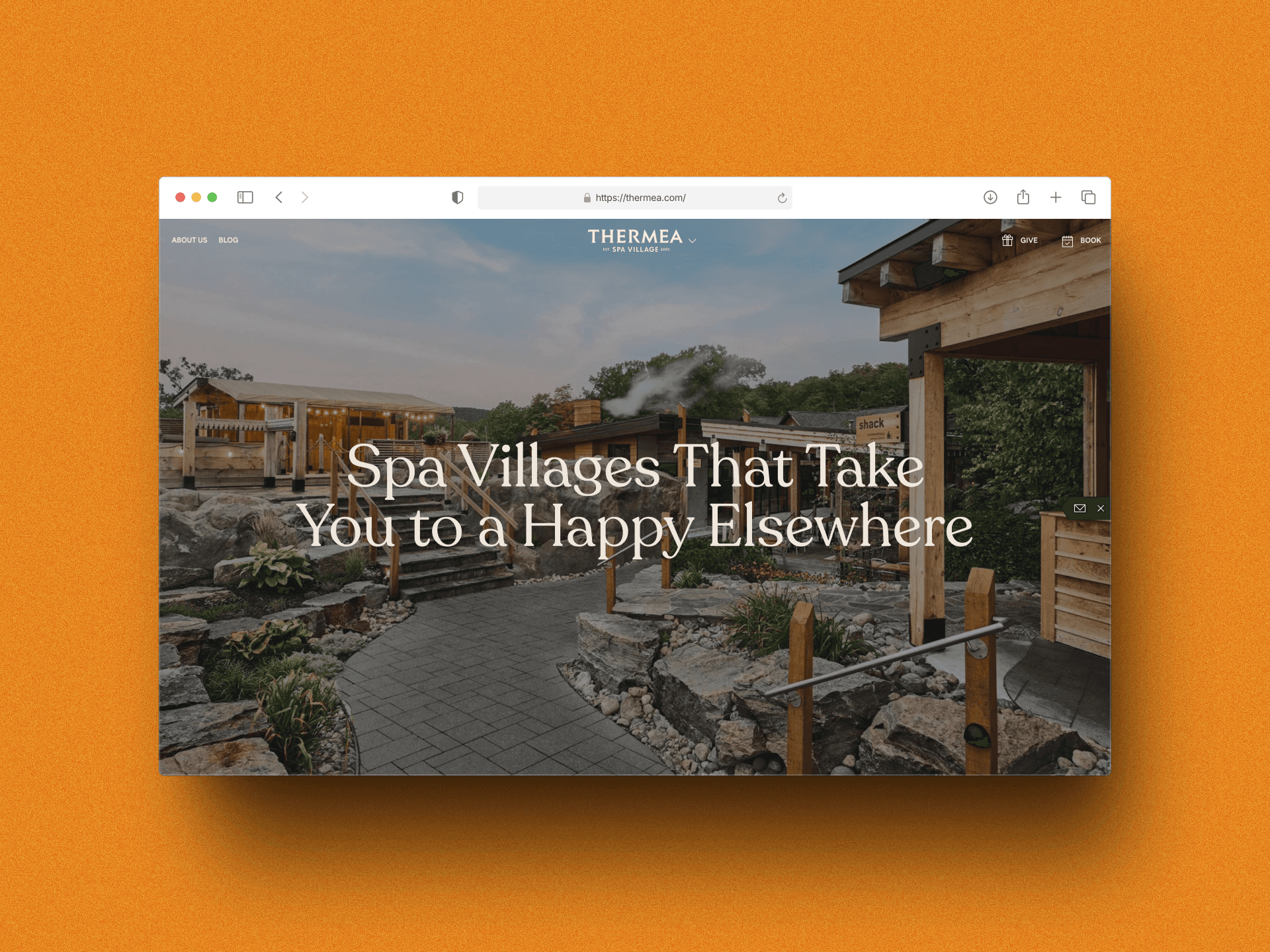
The Site Has to
Feel Like Arriving.
Thermea Spa Village is Groupe Nordik's premium spa brand — three destinations across Canada, each built around the Nordic thermal cycle: hot, cold, rest, repeat. The experience on-site is extraordinary. The digital experience wasn't keeping up.
The brief was clear in intent, complex in execution: build a site that communicates the atmosphere before the visit. Visitors needed to understand the brand, choose their location, and commit to a booking without friction. Each of those three steps required different design thinking — and all three had to feel effortless.
Three Distinct Locations
Chelsea (Quebec), Winnipeg (Manitoba), and Whitby (Ontario) share a brand but differ in offerings, seasonal character, and local context. The architecture had to surface those differences without fracturing the brand.
Photography-Led Design
The product is an atmosphere. The site needed to lead with full-bleed imagery — steaming thermal pools, candlelit saunas, birch-lined rest areas — without sacrificing load performance or text legibility.
Discovery to Booking
First-time visitors are researching. Returning visitors want to rebook fast. One site, two distinct journeys — both had to reach the booking flow without friction or confusion about which location they were looking at.
Bilingual Requirement
Serving both English and French markets (visible in the FR toggle in the nav). Localisation had to be seamless — not just translation, but culturally appropriate content hierarchy for each audience.
Four Principles
That Shaped the Build.
Before writing a component, I established the constraints the codebase would never violate.
Image Performance First
Full-bleed photography at this quality doesn't come free. Every hero, grid image, and section background went through Next.js Image with priority loading, AVIF/WebP format negotiation, and explicit size hints per viewport. Art-direction breakpoints ensured the right crop served the right screen — the horizontal spa panoramas don't translate to a 375px mobile hero without intervention.
→ Core Web Vitals were the acceptance criterion, not an afterthought. LCP under 2.5s on a mid-tier mobile connection, measured before sign-off.Location-Aware Architecture
Each location (Chelsea, Winnipeg, Whitby) has its own seasonal character, amenity set, and booking calendar. The routing architecture separated shared brand content from location-specific pages, making the location picker the natural entry point rather than a buried menu item. ISR kept location-specific content fresh without full rebuilds on every edit.
→ The three-panel location selector is a custom UI pattern — a full-screen immersive picker where switching location transitions the entire visual context, not just the heading text.Editorial Scroll, Not SPA Transitions
The temptation on a visually-rich site is to add full-page transitions and parallax everywhere. I avoided that deliberately. Smooth scroll (Lenis) and IntersectionObserver-triggered reveals do the heavy lifting without hijacking the browser's native scroll model. The result feels premium without the disorientation of scroll-jacking.
→ Every animation has a user-preference check. Visitors with reduced-motion set see clean, instant transitions — the content, not the motion, is the product.CMS-Ready Components
A luxury spa brand updates photography seasonally, promotes rotating experiences, and runs location-specific events. Every content-bearing component was built to accept structured data from the CMS — no hardcoded copy, no image URLs in JSX. The client team can update the experience grid, add a seasonal promotion, or change the hero without a dev touchpoint.
→ Components with optional fields degrade gracefully — a missing tagline doesn't break the layout, it just collapses cleanly. Self-evident to a content editor, predictable for a developer.The Site
In Motion.
Four sections that define the experience — from hero discovery to location selection.
Experience grid: thermal journey, curated
Village Rituals, Saunas, Baths, and Rest Areas — the four pillars of the Thermea experience — rendered as a full-width photo grid with hover-revealed labels and a single editorial CTA. The layout is deceptively simple: a 2×2 image grid anchored by a large serif heading and a ghost button. The photography does the selling; the layout gives it room.

Location-aware storytelling across two brand families
Groupe Nordik operates both Thermea and Nordik Spa Village under the same umbrella. The dark-green “Four-Seasons Village” section uses a collage-style photo layout to communicate year-round relevance — a deliberate counterpoint to the light cream editorial sections above it. Below, the location picker renders all three Thermea destinations as a full-screen three-panel selector, each panel a living photograph.


The Hard
Calls.
Every build has moments where two good options pull in different directions. These are the ones that shaped the final product.
Static Export
Picker, Not a Select
CSS Scroll Snap
for Body Copy
What Moved.
A complete custom site for a premium spa brand that operates across three Canadian provinces.
A spa site doesn't sell a service. It sells the feeling of arriving — the smell of birch, the weight of warm water, the silence between sessions. Build that, and the booking follows.