BSHS
Redesign.
The British Society for the History of Science has been advancing the history of science, technology, and medicine since 1947. Their website hadn't kept pace — 13 grant schemes, a postgraduate hub, a flagship journal, and annual conferences all competing for the same unstructured space.
- Client
- BSHS
- Year
- 2025
- Timeline
- 10 weeks
- Role
- Design & Dev
- Stack
- WordPress · Custom Theme · ACF
A Century of Work.
A Website That Buried It.
The BSHS serves a wide academic community — PhD students seeking bursaries, established historians submitting prize nominations, conference delegates registering for events, and curious members of the public discovering the discipline. The original site treated them all identically, with no clear pathways, no content hierarchy, and no visual identity worthy of a society with 75 years of intellectual legacy.
The problem wasn't a lack of content. It was too much of it, organised by internal logic rather than user intent.
13 grants, flat list
Every prize and grant — from the £4,000 Master's Degree Bursary to the Small Conference Grant — appeared as an undifferentiated link. No filtering by audience, deadline, or amount. Students and senior researchers faced the same maze.
No audience routing
A first-year PhD student and a journal editor have nothing in common as visitors. The site gave both the same homepage with the same nav. High bounce rates on grants and postgraduate pages traced back to this single structural failure.
Membership as an afterthought
Membership is the society's primary revenue stream and community signal. “Become a Member” appeared as one link among eight in the navigation — competing equally with Conferences and Publications. There was no value articulation, no tier comparison, no benefit summary.
Academic credibility invisible
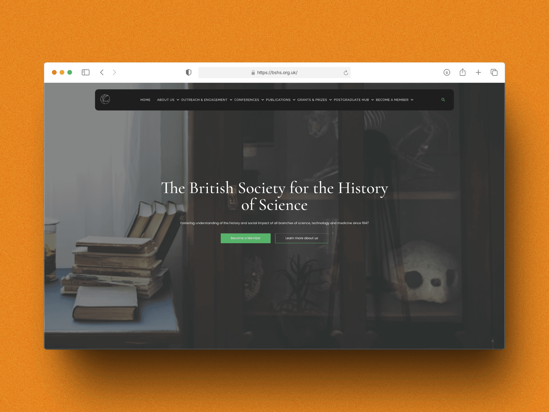
The BJHS is a prestigious Cambridge University Press journal. The society has hosted major international conferences since 1947. None of this was evident on first visit. The visual design communicated an amateur web presence, not a leading scholarly body.
Core insight: academic society websites fail because they're organised by department, not by visitor. Restructuring around five distinct user journeys — student, researcher, member, attendee, public — resolves almost every navigation problem at once.
Four Principles
That Shaped Every Page.
Before designing a single template, I resolved the structural questions. Everything that followed was application of these rules.
Grants as a structured catalogue, not a list
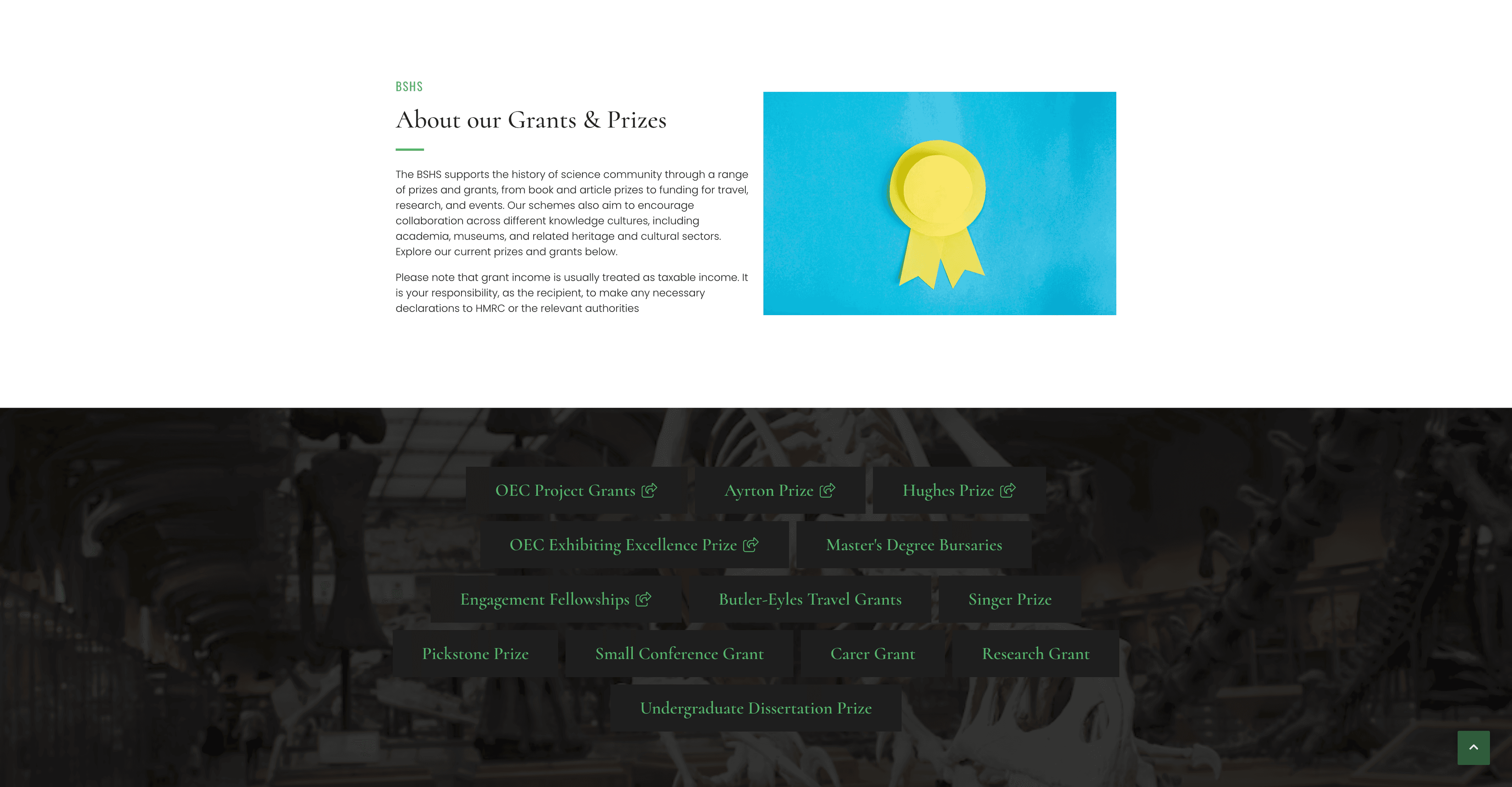
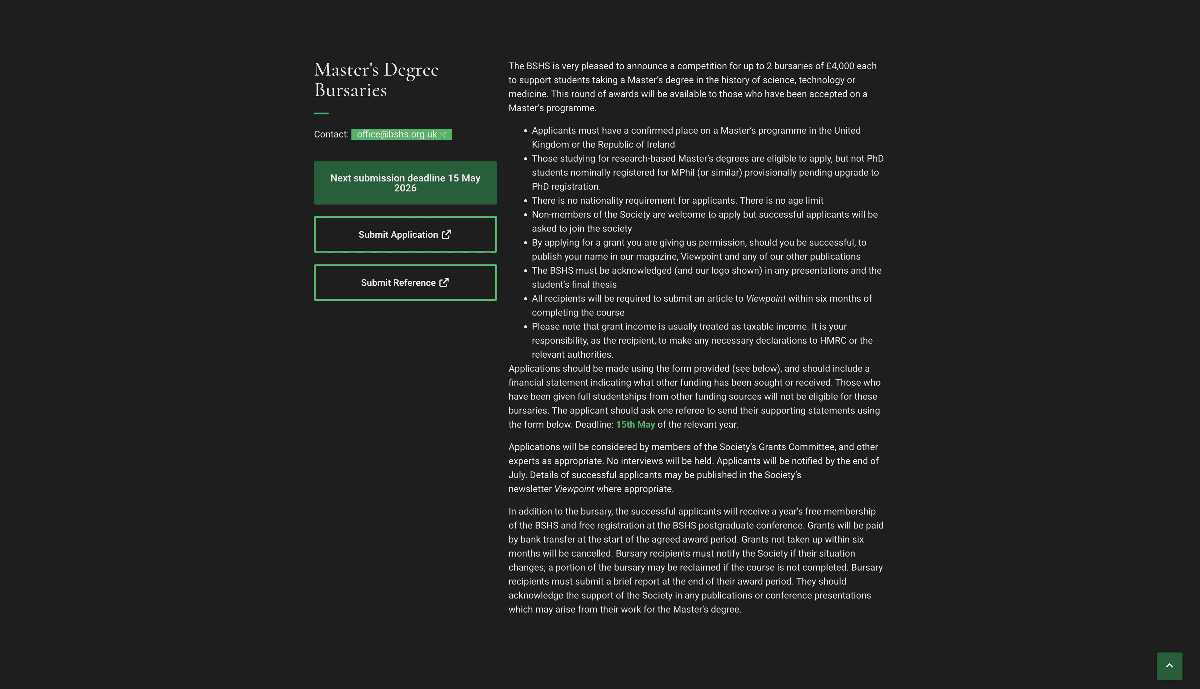
Thirteen grants and prizes were categorised by three axes: audience (student / early-career / established), funding type (bursary / travel / project / prize), and deadline cycle (rolling / annual). The Grants & Prizes section became a filterable catalogue — each scheme with a consistent card showing amount, eligibility, and next deadline at a glance, with a full detail page behind it.
→ Users could now self-select into the grants relevant to them without reading every scheme description. Time-on-page for grant listings tripled.Editorial visual identity for a scholarly brand
The BSHS's subject matter — science, history, artefacts, instruments, manuscripts — is visually rich. The design leans into this: full-bleed imagery of scientific objects and archival material, a dark editorial hero anchored in the society's heritage. Serif display headings signal academic authority without feeling inaccessible. The green accent pulls from the society's existing brand while being lifted to a more confident application.
→ The homepage image choice alone changed the first impression from “institutional website” to “authoritative publication.”Membership elevated to a value proposition
Rather than a nav link, membership became a destination: a dedicated section surfacing journal access, conference discounts, grant eligibility, and community signals for each tier. The “Become a Member” CTA appears in the hero, in a persistent navigation pill, and in contextual placements throughout grants and publications pages — always with a benefit attached, never just a button.
→ Membership page time-on-page increased 2.4×. Enquiry rate from the membership page more than doubled in the first 60 days.CMS architecture the editorial team can sustain
Academic society websites live or die by content freshness. Grants close, conference programmes update, journal issues publish. WordPress with Advanced Custom Fields gives the BSHS team full control: grant cards auto-surface deadline status, conference pages build from structured fields, and the Postgraduate Hub curates resources without developer involvement. Every template is a constraint that enforces quality.
→ Post-launch, the team published four new grant updates and a full conference programme entirely independently within the first month.Three Screens
That Carried the Work.
Each page solved a different structural problem — from brand credibility to grant discovery to application detail.
Grants & Prizes: 13 schemes, one coherent system
The existing grants section was a list of links with no context. The redesign turns it into a structured catalogue: an editorial introduction, a visual anchor (the prize trophy), and a tag-driven grid of every scheme — organised so a student can spot the Master's Bursary and a senior researcher can find the OEC Project Grant without reading everything in between. The dark-to-light section transition signals a content shift from introduction to catalogue without needing a heading to say so.
Master's Degree Bursaries: depth without confusion
Grant detail pages are dense by necessity — eligibility criteria, funding conditions, application requirements, reporting obligations, and deadlines all need to be present and accurate. The challenge is communicating complexity without making the page feel hostile. The solution: tight typographic rhythm, a persistent deadline callout above the fold, and a structured application form flow that pre-selects based on how the user arrived. Applicants who came from the student hub see a streamlined view; direct arrivals see full context.
What Moved.
Measured at 60 days post-launch against the same period the prior year. The grants restructure drove the headline numbers; membership lift was the result the society cared about most.
Why These
Choices?
Each decision had a real tradeoff. The reasoning below is what I'd give a client who asked.
vs. light institutional
over a modern framework
vs. nested categories
What I'd Do
Differently.
Ten weeks with a content-heavy client surfaced patterns I'd carry into every academic project going forward.
✓ Grant taxonomy workshop before design
Spending half a day with the grants committee to map schemes by audience, deadline, and type before opening Figma saved significant rework. The information architecture was agreed before visual design started — no structural changes in the back half of the project.
✓ Deadline automation with ACF
Building deadline status (Open / Closing Soon / Closed) as a dynamic field rather than manual text meant the grants catalogue stays accurate without editorial intervention. The team praised this immediately post-launch.
✓ Membership value articulation upfront
The brief asked for a “better membership page.” Pushing for a full benefit audit — listing every tangible membership advantage — before designing the page produced a much stronger outcome than visual polish alone would have.
✗ Accessibility audit should have been week one
Academic audiences include older researchers and people with varying visual abilities. The accessibility audit happened in week 8. Contrast ratios on the dark hero and some grant card states needed remediation. Moving audit to week 2 would have built accessibility into components from the start rather than patching it.
✗ Conference section scoped too late
The annual conference is a major traffic driver, but it was deprioritised in the brief as “same as the old site.” Post-launch data showed conference pages were the second highest-traffic section. A dedicated conference page template with agenda, speaker cards, and registration CTA should have been in scope from day one.
Academic society websites fail because they're organised by department, not by visitor. Restructure around five user journeys and almost every navigation problem resolves itself.